Fearlessnut's Wamilton Freeride Ski Build

Mark Gomez

is where the surf is
Location
Fullerton, CA
Need help for PAINT ideas!

Because the black on this ski has many stress cracks, is fading from its previous owner leaving it in the sun, and with all the elbow grease I have going into the glass work. I'm sanding the hull this weekend and will be painting it. :party:

But I would appreciate some opinions.
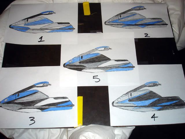
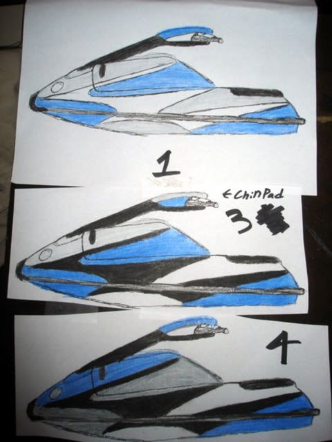
Please let me know which one you like, your voice and opinions matter.

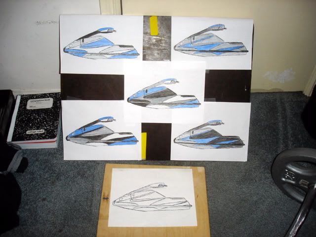
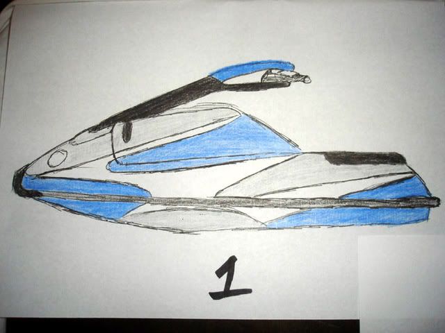
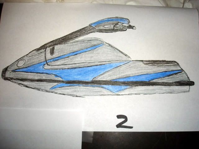
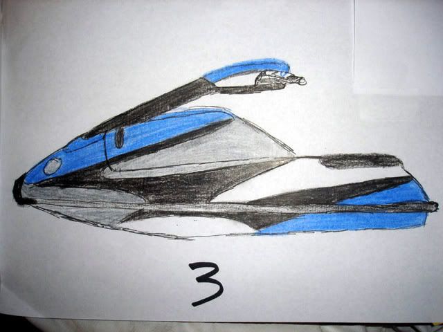
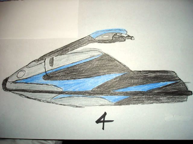
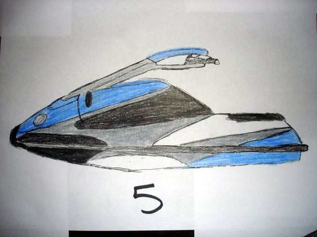
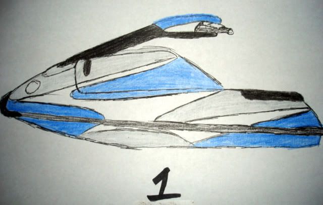
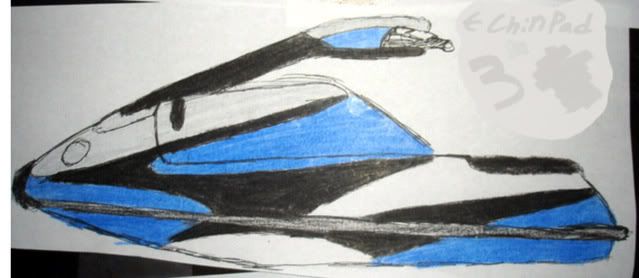
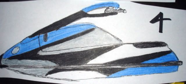
I found a design I liked from one of Joe's old ski's. I sketched out one blank then copied it to make color scheming easier.
DSC00389-1.jpg

The paint I will be using will have a metallic shine to the pencil colors shown.
-Silver will be same as my 550
-Black will be the same as the Handle pole on my 550 and possibly just glossy
-Blue will be Royal Blue with a gloss/metallic look
-and white will be white.
DSC00401-1.jpg

DSC00402-1.jpg

DSC00403-1.jpg

DSC00404-1.jpg

DSC00405-1.jpg

DSC00406-1.jpg

This is where you all come in. Let me know which one you all like or if they just look like a good idea in general.
Thanks!
-Mark
 
Last edited:
Hey Mark, just wanted to say that you are one heck of an inspiration for all the little guys trying to make it in this sport. I just toured your website (very nicely done btw) and read through your build thread. It is all very impressive and you seem like an awesome guy.

Personally I prefer paint scheme number 3, probably the hardest to tape off but I think it looks sweet. Keep up the good work as I'll definitely be watching how it all goes together.

Eric
 

Mark Gomez

is where the surf is
Location
Fullerton, CA
Hey Mark, just wanted to say that you are one heck of an inspiration for all the little guys trying to make it in this sport. I just toured your website (very nicely done btw) and read through your build thread. It is all very impressive and you seem like an awesome guy.
Personally I prefer paint scheme number 3, probably the hardest to tape off but I think it looks sweet. Keep up the good work as I'll definitely be watching how it all goes together.

Eric
Thanks man thats cool of you to say I really appreciate that. im leaning towards 3 also so well see.

i like 5 and 3
thanks bud me too


voice your opinions please send me a pm if you dont want others to see for some reason. Its just paint let me know! thanks!
 

Mark Gomez

is where the surf is
Location
Fullerton, CA
Narrowing it down...kinda

I eliminated #2 Now down to 3
DSC00420-1.jpg

#1
DSC00423-1.jpg

#3
DSC00424-1.jpg

#4
DSC00425-1.jpg

New numbers now so let me know. Thank you all this feedback is really helping.
-Mark
 
Last edited:
Hey Mark, just wanted to say that you are one heck of an inspiration for all the little guys trying to make it in this sport. I just toured your website (very nicely done btw) and read through your build thread. It is all very impressive and you seem like an awesome guy.

Personally I prefer paint scheme number 3, probably the hardest to tape off but I think it looks sweet. Keep up the good work as I'll definitely be watching how it all goes together.

Eric

yes he is haha

and i like 1 and 4
 

tightithrash

Zack Bright. I Thrash.
Site Supporter
Location
Oceanside, CA
3 looks pretty good, but i like 4 cuz i like the blue in the front......but i like the blue on the bottom/front on 3...... i guess its up to if you want blue in front or silver in front. both are very cool though.
 
Top Bottom