The Penguin
triple secret probation
- Location
- down by the river
I think that would be "double to the fullest"
or "to the fullest"^2
or "to the fullest"^2
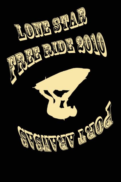
Damn good idea. Keep the one on the nose or on the side?
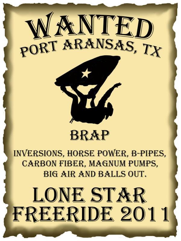
I'm thinking maybe add some bull horns to the ski.............drop the wanted bit. Move Lone Star Freeride to the top, Port Aransas to the bottom..............outline of Texas somewhere below the rider where the words were. ehhh just a thought.
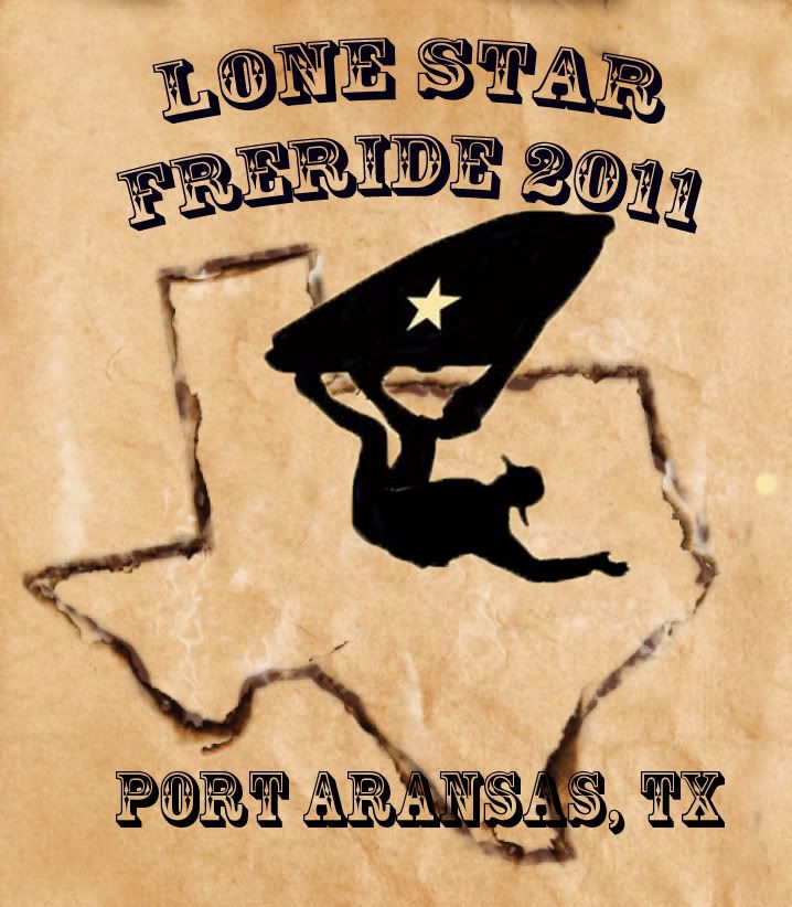
real quick version of what I was thinking.............needs a lot of work though....very rough
^^^^^Now we're talking....Work with that one!! Clean, to the point, easy to read, easy to understand....Gets my vote
The wanted one...doesnt make any sence..brap, b pipe, wanted......to much going on IMO
Daniel


")